Party Tip #2: Color Scheme & Prints
Yayyy! I'm on a roll! My goal this year for my party blog is to share my Top 10 Party Tips that I've learned along the way and I so happy to share with you Party Tip #2 today!
After you have decided on a Theme and Inspiration, a great place to start next is with your Color Scheme and Prints. You want your color scheme and prints to be cohesive so that it helps the Decor, Food, and Dessert all tie in together. When it comes to picking a color scheme and print you want to make sure the pair are a perfect match! You'll want your color scheme and print to coordinate together and create the right feel or atmosphere.
STEP 1: The Power of 3!
Whenever I plan a party I always use the "Power Of 3" when it comes to my color scheme. I also try and choose 3 colors every time. So, I recommend when you plan a party always pick 3 colors instead of 2. For example, if your doing a Firetruck party you can use the colors Red, Black, and Yellow or you can even do the classic Red, Black, and White.
STEP 2: Choosing a Print
You want to pick a print/pattern that you feel will go hand and hand with your color scheme. For instance, I use the Firetruck party as an example. If your color scheme is Red, Black, and White the perfect print to pair it with would be a Black and White checkered pattern or you could even use a Red and White polka dot print. Either print would work! And you could also even pair the two prints together.
STEP 3: The Feel
After you have picked out your 3 colors and your print you want for your party you now have to think about the feel you want for your party. So another thing to think about when choosing your color scheme you want to think about the mood and feel you want the party to be and what you want your guest to experience.
Little Man Spring Baby Shower
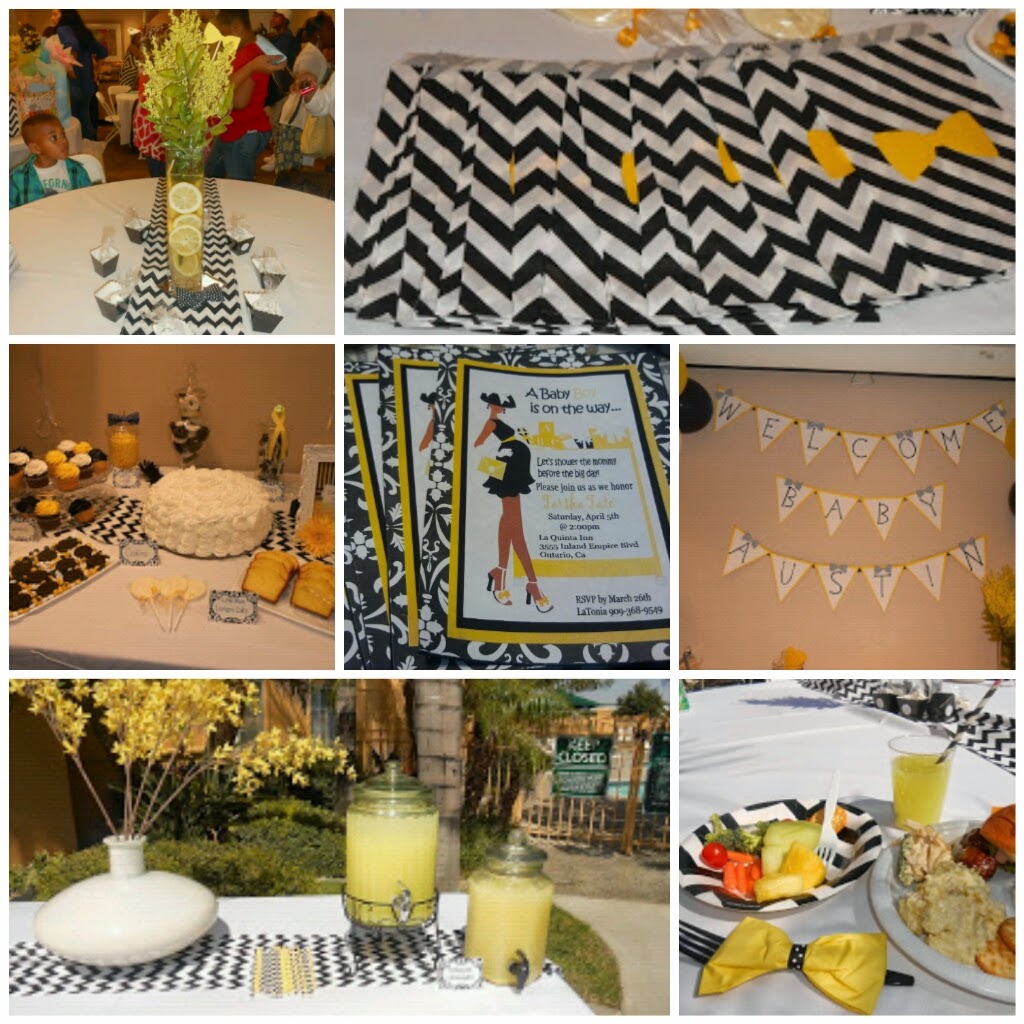
Color Scheme: Yellow, Black, and White
Print/Pattern: Chevron
The Feel: I wanted it to be a Bright and fun but with a Sophisticated feel.
For the Little Man baby shower, the Mommy-to-be wanted the baby shower to be Yellow and Black and following the power of 3 rule I added in the color white. She wanted something chic and classic and I thought black and white would be perfect. We had the color scheme down pack but the print on the other hand wasn't so easy. When we first started the party planning process the print that was chosen was Dasmask print, then half way through the baby shower planning we changed the print to chevron. Even though we were going for a sophisticated feel she wanted something trendy and Chevron is a very trendy fun print that's in right now.
I showcased the color scheme through out the entire party, the Invitations, the food and party punch, and the Candy Buffet table. For Decorations, I showcased the chevron print through Chevron plates, Chevron Table runners, Chevron Paper straws, and even Chevron Treat Bags.
Love is... Valentine's Day Party

Color Scheme: Red, Black, and White
Print/Pattern: Stripes
The Feel: I wanted a romantic and classic feel.
For my Love is... Valentine's Day party I want everything to be black and white just like the comic strip prints in the newspaper. So my color scheme became black and white with pops of red. I wanted the color red to represent the Love part.
For my print, I picked stripes. I love stripes and I hadn't had a chance to work with them before so this was a great opportunity to finally use stripes. I showcased stripes on the Printables, Backdrop, and Fondant Cupcake toppers.
Flintstone's Birthday Party

Color Scheme: Brown, Baby Blue, and Orange
Print/Pattern: Dino Spots
The Feel: For the feel of the party I wanted it Bright and Energetic!
For my cousin's sons' birthday party she wanted bright colors and I love bright colors so I was ecstatic for this color scheme. I based the Baby Blue, Orange, and Brown color scheme from Fred and Barney's shirts. Fred wears an Orange shirt with a Baby blue tie and Barney sports a Brown shirt. The Brown, Baby blue, and Orange color scheme tied in so well together and was perfect for little boys. When I begin planning the boys party I didn't have a print in mind at all. I didn't know what print I wanted to pair with the colors and I really loved the colors so I didn't want a print to over power the color scheme, so instead of a print I use Dino spots throughout the party. I loved using Dino spots as a detail and after all Dino is Fred's sidekick so it worked out perfectly.
I showcased the color scheme throughout the party with the Candy Buffet table, Favors, and Printables. To showcase Dino and his spots I had him added to the Backdrop, used purple envelopes with black spots, I made the centerpieces resemble his spots, and I even found a Dino chocolate lollipop.
As promised, I'm giving you another sneak peak to my baby shower. Since were talking about color schemes and prints today I'm going to share with you our baby shower color scheme. The color scheme for our baby shower is Navy Blue, Orange, and Mint. I wanted to use the typical Nautical Navy Blue color but I didn't want to use the typical Red, Blue, and White colors we see used so often. So to stay true to the Navy Blue color I wanted to find colors that would pop against the Navy Blue. And for my prints I'm using a couple different prints like Chevron prints and Polka dots.

Bonus Tip: Here's an extra tip I hope helps! Think outside the box! Pick colors that are outside your comfort zone. Color combinations that you would not necessary pick or pair together!
I really hope this post was helpful!


Comments
Post a Comment